Senior Product Designer
2 years 10 month
🦄
Built scalable billing solution for Estonian unicorn
My role
Worked closely with customer success, engineering, product, and marketing leaders to develop a solution that is both customer-centric and drives business KPIs
Redesigned end-to-end whole Billing-related product area for scalability in the midst of transition to multi-product strategy with new approaches to monetisation
Gathered insights from customer interviews, customer success roles and analytics while following closely with company strategy to create mindmap flows, wireframes, user interfaces and hight-fidelity prototypes for usability studies
Consulted with researchers, analysts, content strategists, illustrators, localization managers, as well as other designers and engineers
Organised and shaped the format of “Exploration labs”, which are used in the Pipedrive as part of the product discovery process
The outcomes
Significantly increased trial to paying conversion
The scalable billing system enabled the company to proceed with its new multi-product strategy, offering flexibility for other teams to choose the monetization method that makes the most sense for their needs
Initial billing redesign allowed for better tracking and as a result improved the data-informed decisions making in the future iterations
Well-informed about customer pain points, concerns, workflows we streamlined the user interface, which allowed to decrease amount of support tickets around billing, invoicing, user management, as well as to fix crucial compliance issues along the way
Took an active part in the corona task force, where we proactively and promptly implemented new logic and interface tweaks that improved the retention of existing clients. Addressed policy changes via a transparent and clear interface, which allowed us not only to mitigate the impending crisis but also to increase revenue
Data-informed and outcome-oriented design
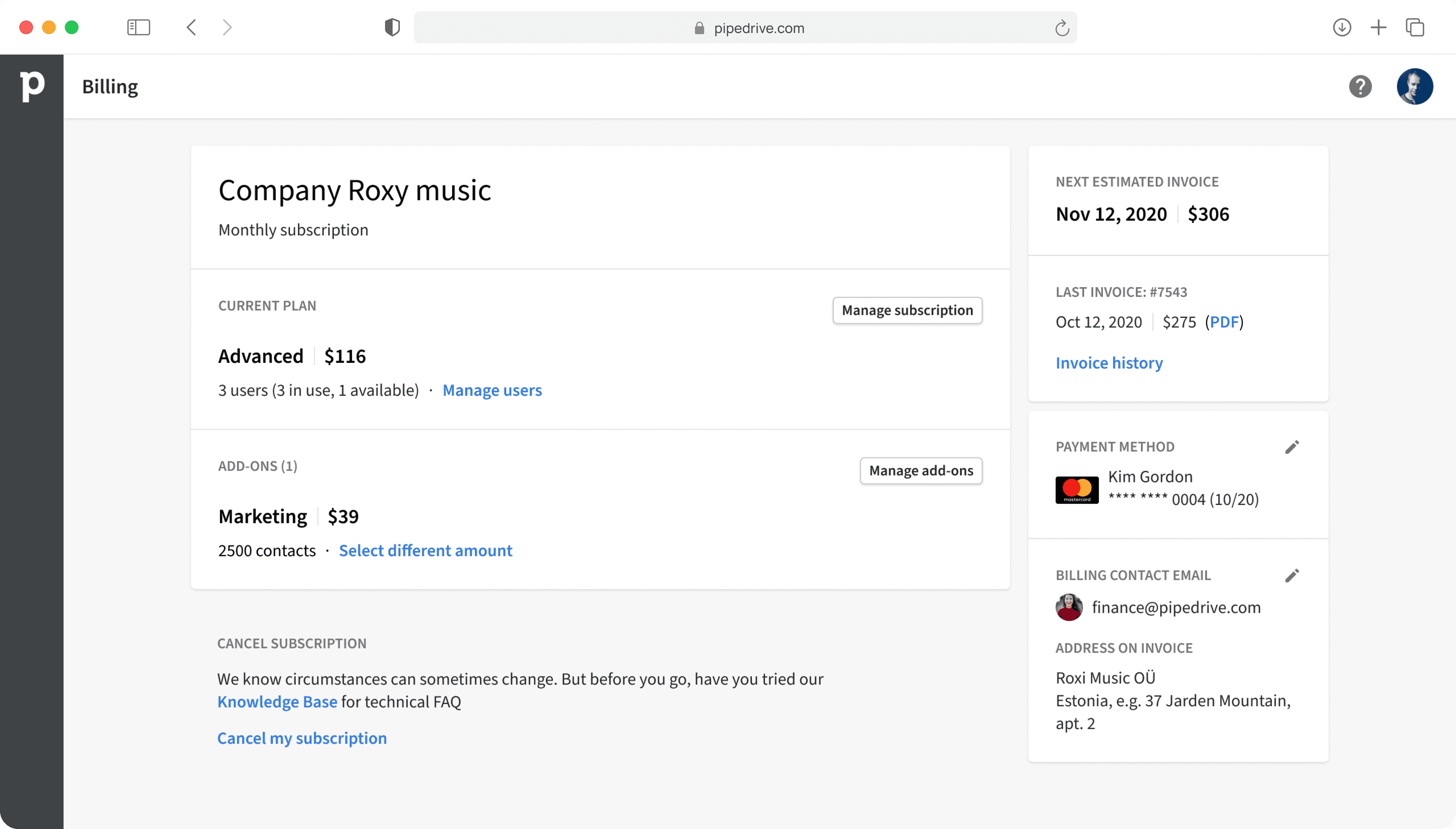
From the interviews and surveys with users we understood why they visit billing overview, this helped us to identify their main tasks, and journeys.
We implemented better IA with necessary entry points. Displayed essential information that was previously missing to address user goals in the most natural way.
Helped users to make a right choice
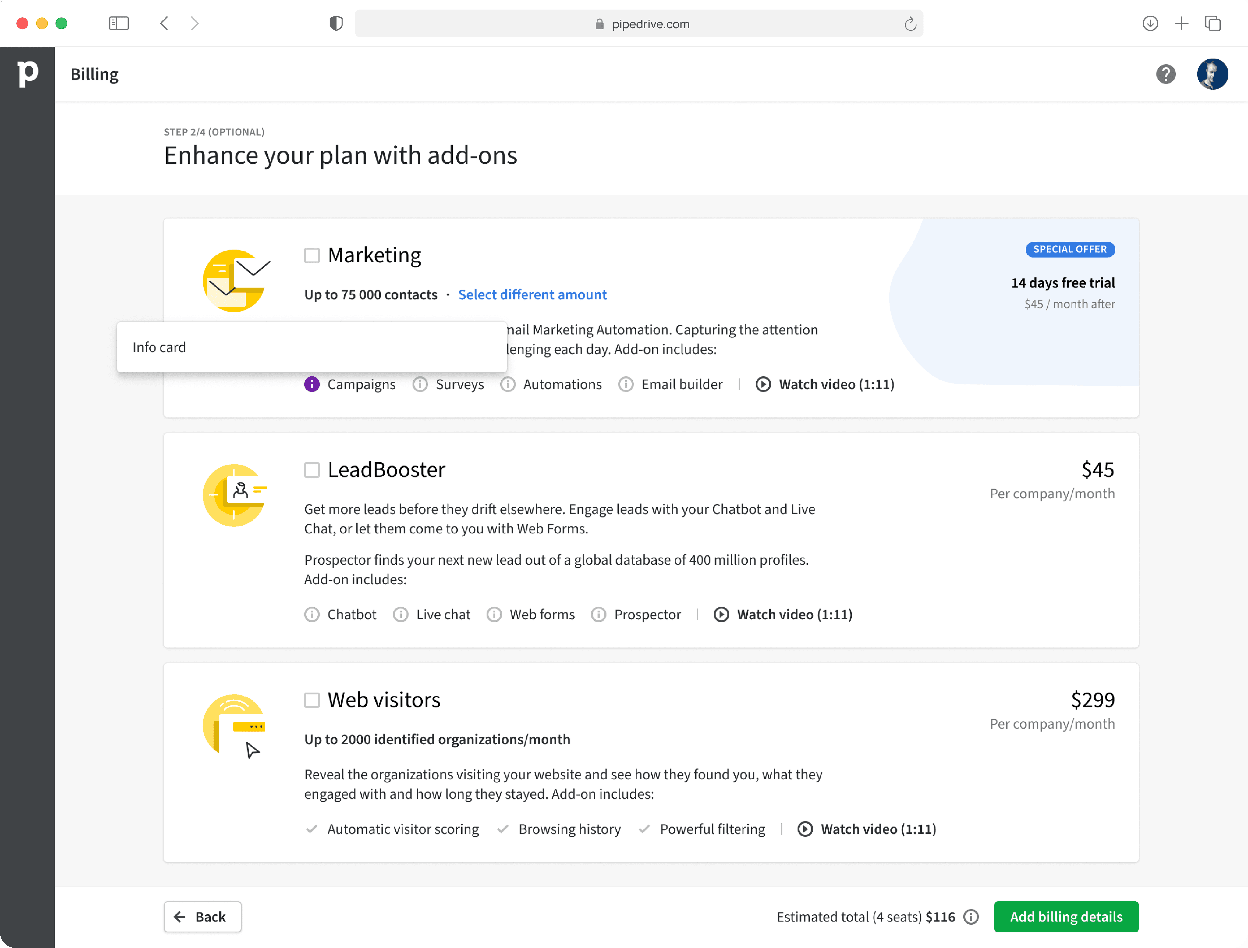
We used a progressive disclosure for subscription flow, replacing the old one-pager with low conversion rates. This change enabled us to track conversion step by step (in a funnel). Plus, in the new flow, each step is dedicated to a specific task.
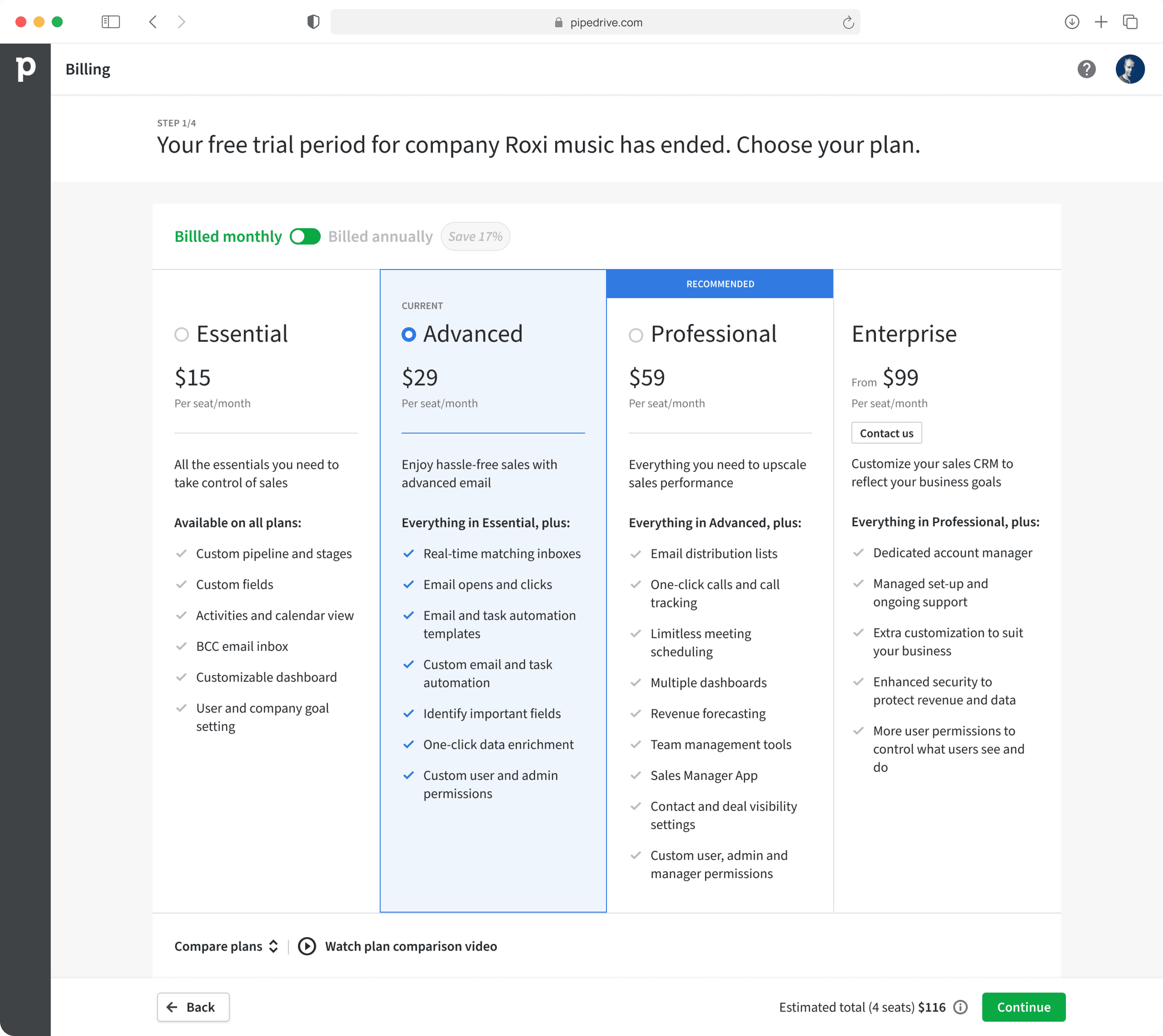
Together with marketing we established clear buyer persona for each plan and bundled the plan features accordingly.
We made several adjustments during the validation testing. To accommodate users with different learning styles and requirements, we added concise text for each plan, offering a clear value proposition for each buyer persona. Additionally, we included feature video overviews and a comprehensive comparison table to assist larger enterprises in vendor assessments.
Helped support team to save time
In the second step, we focused on guiding users to provide accurate billing details. This was achieved through improved labeling, contextual help, and necessary explanations. Validation testing revealed areas where users needed the most assistance.
This allowed us to relieve support agents from the manual task of reissuing invoices due to user-input mistakes.
Created full transparency for users and compliance with all financial regulations
A modular checkout system that supports a multi-product strategy with various monetization methods.
We achieved full transparency for users by addressing all concerns and potential questions through extensive UX studies.
Contact me if you want to learn more about my experience designing for award-winning product (unicorn from Estonia) which is loved by hundred of thousands salespeople from around the world 👋
maksym.viushkin@gmail.com


